Wednesday 29 December 2010

DPS analysis.


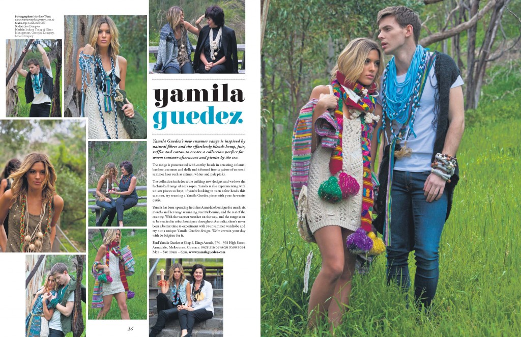
I like this because of it's simplistic format. I like the grafics on the left as usually it is on the right. I think this works well and it throuws you over to the right hand side as you follow the green to the bottem of the text. Your eyes easily follow the colours.

Tuesday 28 December 2010

Contents Page Anaylsis


I like this idea because of the tidiness. I think that the yo yo could be used but using it as the MOD logo. The clarity of the text works despite it being so very simple. It would also work effectively with out colour palette.

Tuesday 21 December 2010

Contents Page


This magazine uses the 3 colour pallet similar to that of ours. It clearly stands out because of the bold titles. I think I like this because it is different. It looks good and is still simple. I think this style would work for MOD magazine however i do not think the fonts will work as well because MOD tends to be tidy and clean, so this will mean that the font will have to be.

Saturday 18 December 2010

DPS analysis


I like the colours and the theme of this. I like the use of images that are used to produce a story it reminds me of a storyboard. I think the idea of photos to tell a story could hold a lot of interest but I think it would be difficult to make this work.

DPS analysis


I like this as the text is at the bottom, again this is different stylistically and  works with what type of magazine it is. I think this looks effective as your eyes are always drawn to the top of the magazine so her it is dragged to the bottom. These suttle differences are the ones that make the reader's interested in your articles and want to carry on reading because it moves your eyes.

contents page


As I came to make the mock up of the contents page I struggled for ideas. I came up with something like NME and I thought it was too plain and did not stand out. This will be in a following post. Without any inspiration coming from the music magazines and ones we had already looked at, I decieded I have to look into other magazines for inspiration. I like this contents page because it is simple but still inspiring and effective. Having the darker colours in the picture makes the forecolours (fonts) stand out. Therefore allowing the reader to view it easier.

Tuesday 14 December 2010

 
I like these image's I think this could work well, if you used people out of the band on the right hand side and the girl with a guitar for the girl on the top one. However I do not think the name of the magazine would go through the middle. However I think the name of the band should go through the middle of the red strip. This would be very effective after a play around in Photoshop.  

Monday 13 December 2010

Front Cover inspiration


I like this front cover I think it could work really well for my magazine. I believe i will have to do research into ideas about how this could work with my person on the front of the Vinyl. I do think you need the needle in the image otherwise it would work. However could i make the image of my main article the needle? I do not think it will work but I do like the layout of this. I will look into it some more and do some more research.

Sunday 12 December 2010

Front Cover.


I think the tidiness of this magazine works. I also like the abstract microphones perhaps I could put something like this in my magazine.

Friday 10 December 2010

DPS analysis


I like the  idea of how the page resembvle the title "endless city" This works well and this is stressed by the page layout. I like the colour contrast and i think it works really well.

Front cover Anaylsis

I think this magazine the colours and everything work really well. I think that the big group of people also works well. However i do not think this would work overly well for my magazine because it is very indie.

Tuesday 7 December 2010

DPS analysis


I like this as I think it works with the picture. The colour scheme is clear and looks the neat this means that it would fit into our MOD design. However there is not alot of text so we would have to adapt this. This would advertise for our audience age.