
Showing posts with label Photography. Show all posts
Showing posts with label Photography. Show all posts
Sunday, 27 February 2011
Photography
Monday, 31 January 2011
Model poses
 |
| This style would be what we aim for our models to wear. |
 |
| We think this is very clever, how the image is made with the mirrors. Possibly we could use the mirrors but place London scenery in them opaque. We think this would look very clever. |
 |
| This is taken at piccadily circus. This is what we are thinking of doing ^ |
 |
| This is an image from an interview. I think that if you do this but if you put some colour behuind it. |
Monday, 24 January 2011
front cover text.
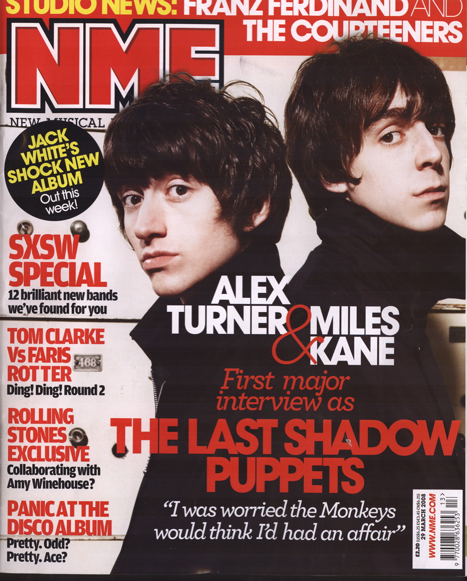
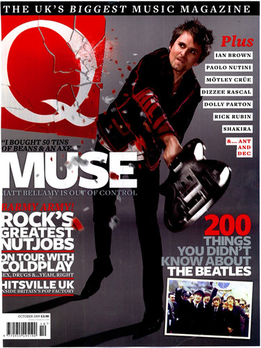
Both of these magazines have their logo/masthead (NME&Q) in the top left hand corner of the page. Despite them not being very big, they still stand out very clearly against the rest of the images and text on the page. They are located there so they stand out in the shop and they catch the readers eye, it easily allows someone to recognise the magazine. So we think that we will do the same with the MOD logo.
Wednesday, 19 January 2011
Photography

 For our images, we are thinking about using iconic britislandmarks our "trademark" as I-D does with the one eye closed. This will be expensive so we will have to create more funding as we will have to go to iconic places to do the photography... or we could use photoshop skills to put the model in the picture with the landmark. I will have a play around in Photoshop and see what i can do, and how effective it wil be, therefore it would only be a one day shoot.
 Tuesday, 14 December 2010


I like these image's I think this could work well, if you used people out of the band on the right hand side and the girl with a guitar for the girl on the top one. However I do not think the name of the magazine would go through the middle. However I think the name of the band should go through the middle of the red strip. This would be very effective after a play around in Photoshop.
Subscribe to:
Posts (Atom)