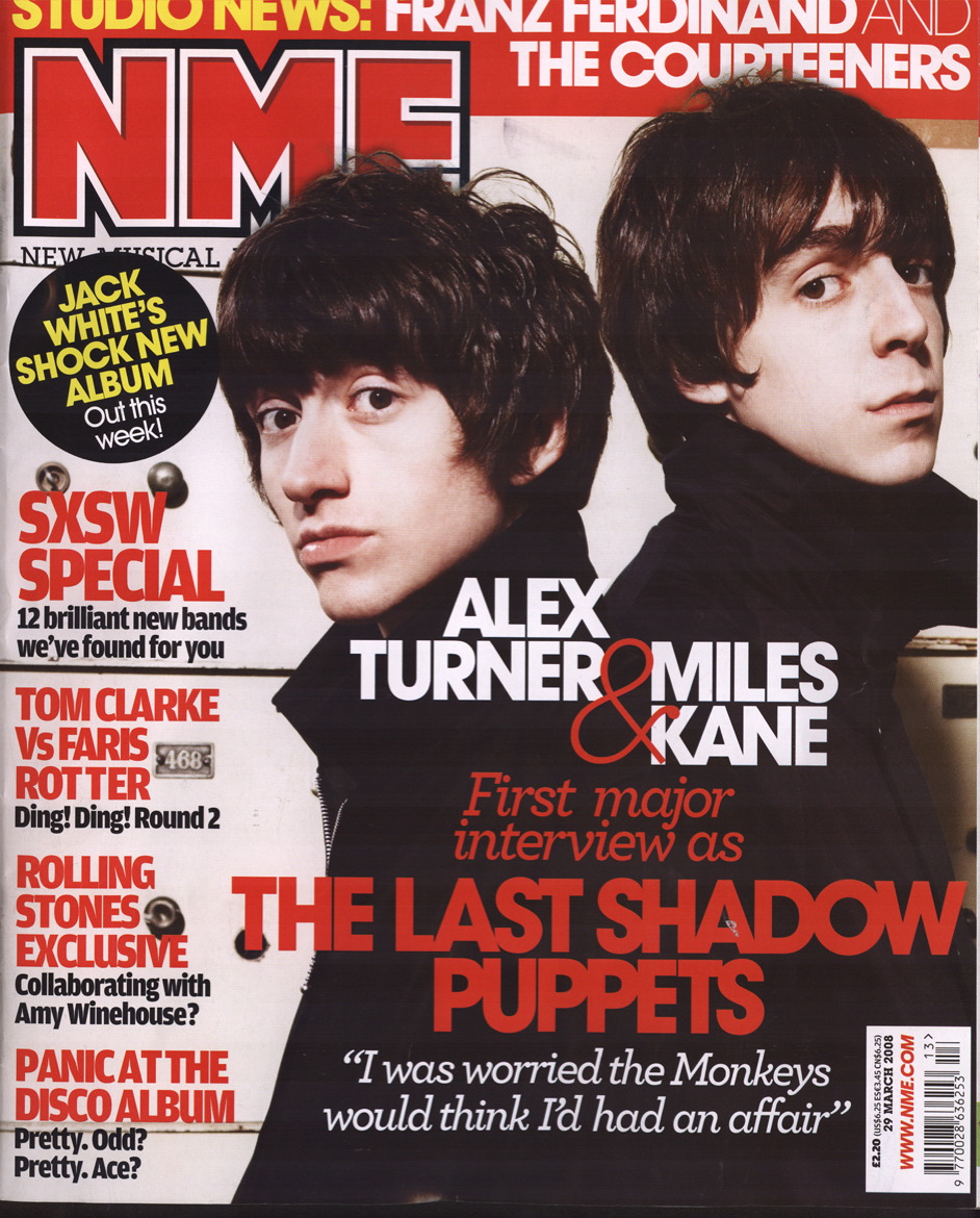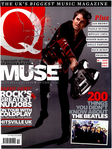

Both of these magazines have their logo/masthead (NME&Q) in the top left hand corner of the page. Despite them not being very big, they still stand out very clearly against the rest of the images and text on the page. They are located there so they stand out in the shop and they catch the readers eye, it easily allows someone to recognise the magazine. So we think that we will do the same with the MOD logo.
No comments:
Post a Comment