Monday 31 January 2011

Model poses


1965: Elvis for Everyone
This style would be what we aim for our models to wear.
1970: The Who in the mirrors
We think this is very clever, how the image is made with the mirrors. Possibly we could use the mirrors but place London scenery in them opaque. We think this would look very clever.


1965: Piccadilly Circus
This is taken at piccadily circus. This is what we are thinking of doing ^


1972: During an interview
This is an image from an interview. I think that if you do this but if you put some colour behuind it.


Thursday 27 January 2011

this is our mack up of our fron cover. This is the style of imagery we also want... we aim to get something like this but with higher quality of imagery. We want to keep the front, clean and tidy like the MOD culture clothing. (Left)

Here is our main article spread we want it go across the double page, like in NME because we think it looks effective and interesting. (below)


our contence page. (left)

Monday 24 January 2011

London

We have re-created this picture and made the iconic picture stand out more than the original. The background looks good as it is abstract and black and white. I copied the picture of the bus into photoshop then copied layer 2, then i took the back ground into the black and white effects, created greater contrast and then edited the shadows etc. Then i went around the outside of the bus, bliured the edges and created this.

London pictures for inspiration

front cover text.


Both of these magazines have their logo/masthead (NME&Q) in the top left hand corner of the page. Despite them not being very big, they still stand out very clearly against the rest of the images and text on the page. They are located there so they stand out in the shop and they catch the readers eye, it easily allows someone to recognise the magazine. So we think that we will do the same with the MOD logo.

Sunday 23 January 2011

questionaire

I published a questionaire on Facebook to people who i know like the genre that our magazine caters for, new and upcoming bands, these are the questions i asked:
1. What is your favourite type of music magazine?
2. How often do you buy it?
3. Do you prefer monthly or weekly issues?
4. Do you prefer a music magazine to have a broad range of genres (e.g. NME) or focus on one type of music (e.g. Kerrang!) ?
5. How much would you be willing to pay for a weekly magazine?
6. What is your favourite band?
7. What is your favourite genre/ cross-over genre (e.g. Pop punk)?
8. What music magazine layout/design do you like best?
9. What type of features do you like the magazine to include? (e.g. Gig reviews/ interviews etc)
10. If you could what would you add/change about your favourite music magazine?
In total 19 people responded the most popular answers I got back were:
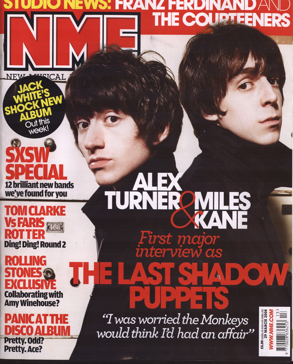
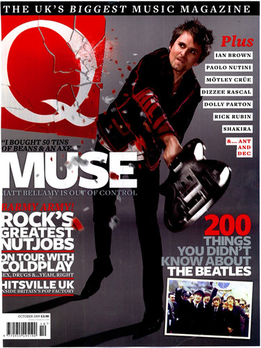
1.Kerrang! Q, NME
2.Every week, when the issue is about a band they like.
3. Monthly
4. Broad
5. Anything under a fiver
6. Muse, mumford and sons, Passion pit.
7.Rock
8.Loads of stuff on the page about random articles that make me laugh, kinda like Kerrang or Q
9.Gig reviews and interviews are always cool. FREEBIES TOO, information on gigs, interviews, posters
10."Just including the artists I don't like", "Expand the genre a little bit, the bands have become fairly repetitive" "more on new bands"

Contents page analysis

logo/name the final one

After working in Indesign, Photoshop and Illustrator I came up with this final piece working with the ideas of Moll's, I think this works well and fits into the genre & style of the magazine.

Thursday 20 January 2011

Beady Eye - NME - Analysis


As you can see this double page spread has a large picture in the middle, a main feature (Liam Gallagher). He's had that picture done in an professional photo shoot.
This interview has a lot of text and quotes in it. Again NME have stuck with an 3 colour pallete, this time black, white and gold. This again stands out very well but it isn't too flashy. The pictures' colours match the writing font aswell.
I like seeing a main picture in the middle to focus on and having text on both sides of the picture. This makes the larger interviews not only more interesting to read but easier to read as it helps space out the writing so its not all a one, big pile of writing.
Also i think that the use of important quotes that have been put in between text helps space out the writing aswell. Having the quotes in larger, bolder writing and in a different colour font allows the reader to see what that part of the text is about. For example Liam says "I think the tunes are just as good as 'definitely maybe', if not better. (this is located at the right hand side of the right page).
The interview itself asks alot about the bands appearance, their style of music, their plans for their band and themselves individually, as well as how successful their music is and what their music is like.

Wednesday 19 January 2011

Photography


For our images, we are thinking about using iconic britislandmarks our "trademark" as I-D does with the one eye closed. This will be expensive so we will have to create more funding as we will have to go to iconic places to do the photography... or we could use photoshop skills to put the  model in the picture with the landmark. I will have a play around in Photoshop and see what i can do, and how effective it wil be, therefore it would only be a one day shoot.

Monday 17 January 2011

Institution Profile

Look at a style model similar to the film/magazine you will produce and research:
• Who produces it?
IPC Media (formerly International Publishing Corporation)-
• Hardware/software they use
Adobe Photoshop, Adobe illustrator, Adobe indesign
• Techniques they use to appeal to new/existing audiences
The Title of the Magazine(New musical Express) the use of iconic people of the front cover. The other things they do e.g Radio, awards  
• Marketing techniques
Radio, shops, online, tv.
• Who distributes the film/magazine
Shops and there online company.
• How is it exhibited?
Mid shelved, so when you look it is at eye level.
• Reasons for success/failure
It is an iconic magazine, supports new music & has a reputation.

What we need to do

  • Capitals I's
  • Comment on the Interviews
  • Get more people to comment on Pitch
  • Pitch feedback
  • The questionaire on Facebook
  • Analysis of Magazines
  • Anaylsis the market research
  • Institution profile
  • Test shots/location shots
  • Shots of London setting
  • Double page spread-1000 words   

Thursday 13 January 2011

orginal fonts that are already associated with MOD


the MOD culture logo and 'the who' logo carry the similar style with the arrows in the font as it does with the targets (faint white) in the words. These arrows are very iconically MOD. Pretty Green logo looks very '60s' (where the MOD culture started from). Also the roundness of the logo and the font helps represent the MOD target. Bass Weejun, Fred Perry, Vespa, Ben Sherman and the Who logo fonts are all simple and bold. They are all clear and easy to read.

Wednesday 12 January 2011

Liam Gallagher, MOD Style

pg-party17


This displays a lot about MOD culture, clearly shows the colours and the fashion style associated with this music. Liam Gallagher who is defineltely well known for his music and his type of fashion and his arrogant personality. I am very inspired by this picture as Liam shows his passion for the MOD culture and it shows others bout what MOD is about.

Liam Gallagher interview.

  we love the arrogance and attitude in the video. this is what makes it a great interview.

Weller

i like the colours, and the photoshop effects here, following the shodows witht he blues and the black and the white. which is the colours are those we aim to use. i like how he stands out, and is the centre of our attention.
      I like his stance, how he avoides the eye contact with the arrogance, but also that its as if her doesn't know you're there. The idea of his wearing the Ray's all the time also shows his mischeif and how we do not know the  whole of him. This is also the same in his interviews, he doesn't let you get to know him.

NME Awards 2010 - Kasabian


An interview with Serge and Tom (from Kasabian)
NME interviews them in a more relaxed way, asking them questions on what they think about NME aswell as what they like about things such as other people and music.

NME Awards 2010 - Paul Weller - Godlike Genius

NME TV: Roger Daltrey & Paul Weller

God like Genius Weller

Thursday 6 January 2011

Pitch

Create your own video slideshow at animoto.com.

Contents Page Inspiration


This album cover has been given a negative colour contrast. I was thnking with the contents page that possibly we could use something like this, with the amp but with the negative colours. But change the colours to fit with our colours pallette.

Contents Page


I think that this contents page works because of it's clear layout. Maybe instead of the colours at the side we could use guitars. I also like that it is a DPS because it is not so crushed together which would work for MOD with the tidyness. I think this would work better for us.

Wednesday 5 January 2011

Audience profile/Name

We have decided that the name of our magazine will be MOD. As its a genre of which holds both of our interest,  this is because both of our Dads were inspired by the genre of music. Naturally passing their interest to us throughout our music and fashion you can see the influences. Therefore we thought that it would only be natural to write to an audience which shares similiar interests. As 80s fashion comes back, we see people wearing Fred Perry, Ben Sherman, Parkas with no knowledge of its history or meaning, therefore we think its only right to create a magazine of bands and fashion will bring to light the real, individual great music that goes with this genre our appeal is to those who are interested in this fashion and people who are already inspired and need new people to follow. 
We will also appeal to those who want to follow new and upcoming bands and fashion.  

Contents Page Analysis


 This is another DP contents page. I really do like how tidy, neat and easy to read the contents page is. I also like how it has the next issue on this one, as we are producing 2 magazines we could easilydo this.

Tuesday 4 January 2011

Contents Page Analysis


I like this contents page because of it's stlye however it does not fit into the MOD culture. I think that the style of the page numbers being different sizing would work, just tidier.

Contents Page and Photography

I think that for our contents page we need to do another photo shoot but with a variety of people perhaps with a variety of styles. This is because it means we can put more picture into the contents so it looks more official and final.

Monday 3 January 2011

Mood borard

Contents page analysis


The tidiness of the would fit in with the MOD culture. It also looks modern and tidy. I like the various text fonts at the bottom of the page. This is effective and would work well with someone on the stage or something.